Understanding box-sizing in CSS
Introduction
This is a post in a series about topics covered in Josh Comeau's CSS for JavaScript Developers course. These posts will be brief, polished versions of my notes, and I'll write about new things I learned or deepen my understanding of something already familiar to me.
In this post, we'll learn about the CSS box-sizing property covered in module 1 of the course.
The box-sizing property
The box-sizing property determines how the width and height of an element are calculated. It accepts two values: content-box and border-box.
content-box
content-box is the default value of box-sizing. With this value, width and height are applied to an element's content box and do not include its padding and border.
Thus, the total width of an element will be the sum of its width and any horizontal padding and border. An element's height will be its height plus any vertical padding and border.
Take the following example:
The final width and height of the .box is 150 pixels: 100 + 2(20) + 2(5).
We can inspect the element in the dev tools to help us visualize this:
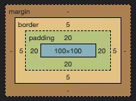
The content area remains 100x100 pixels and the padding and border are added around it.
border-box
With box-sizing: border-box;, the width and height properties include the size of the element's content area, padding, and border.
Here's what the previous example looks like with border-box instead:
And this is what the element looks like in the dev tools:
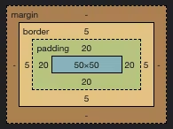
Notice that the padding and border remain the same size, but the content area is reduced, making the final width and height 100 pixels.
Here are the two examples side-by-side for comparison:
Resetting border-box
Sizing elements with content-box is unintuitive because it requires us to subtract or add values to get the desired width and height. Working with border-box is more natural: if we set an element's width to 500px then we know its final width will be 500 pixels.
You can use border-box sizing for all elements with the following CSS reset:
*,
*::before,
*::after {
    box-sizing: border-box;
}
Test your knowledge
Check your understanding of box-sizing by figuring out the width and height of each .box in the following snippets.
#1
.box {
    box-sizing: border-box;
    height: 100px;
    border: 2px dotted;
}
What is the total height of this .box?
Click to reveal answer
100 pixels. The content area is reduced to include the border.#2
.box {
    width: 40px;
    height: 40px;
    padding: 10px;
}
What is the total width and height of this .box?
Click to reveal answer
60x60 pixels. The content area does not include the padding, so we add that to the width and height.#3
.box {
    box-sizing: content-box;
    width: 30px;
    height: 50px;
    margin: 10px;
    border: 3px dashed;
}
What is the content area of this .box?
Click to reveal answer
30x50 pixels.#4
.box {
    box-sizing: border-box;
    width: 100px;
    height: 100px;
    margin: 10px;
    padding: 7px;
    border: 1px solid;
}
What is the content area of this .box?
Click to reveal answer
84x84 pixels: 100 - 2(7)- 2(1).Summary
box-sizing controls how the width and height of an element are calculated. content-box is the default value and width and height are applied to an element's content area. border-box is more intuitive; the content area of an element is reduced to include any padding and border.
Let's connect
Come connect with me on LinkedIn, Twitter, and GitHub!
If you found this post helpful, please consider supporting my work financially:
☕️Buy me a coffee!